
In the summer of 2019, I went to Osaka, Japan with my parents and our family friend's family. I've visited Japan many times before as a child but I never had the opportunity to record my trip there on paper. Thus, I decided to take this chance to capture my surroundings using pen, coloured pencils and Copic marker pens to make illustrations. The main subject area that I focused on was Japanese food because the food, especially in Osaka, is something that I find is the speciality of the place and every dish served is so beautifully arranged that I couldn't help but represent my admiration through my drawings. This experience also made me realise my interest in food illustrations in which I hope to continue in the future.
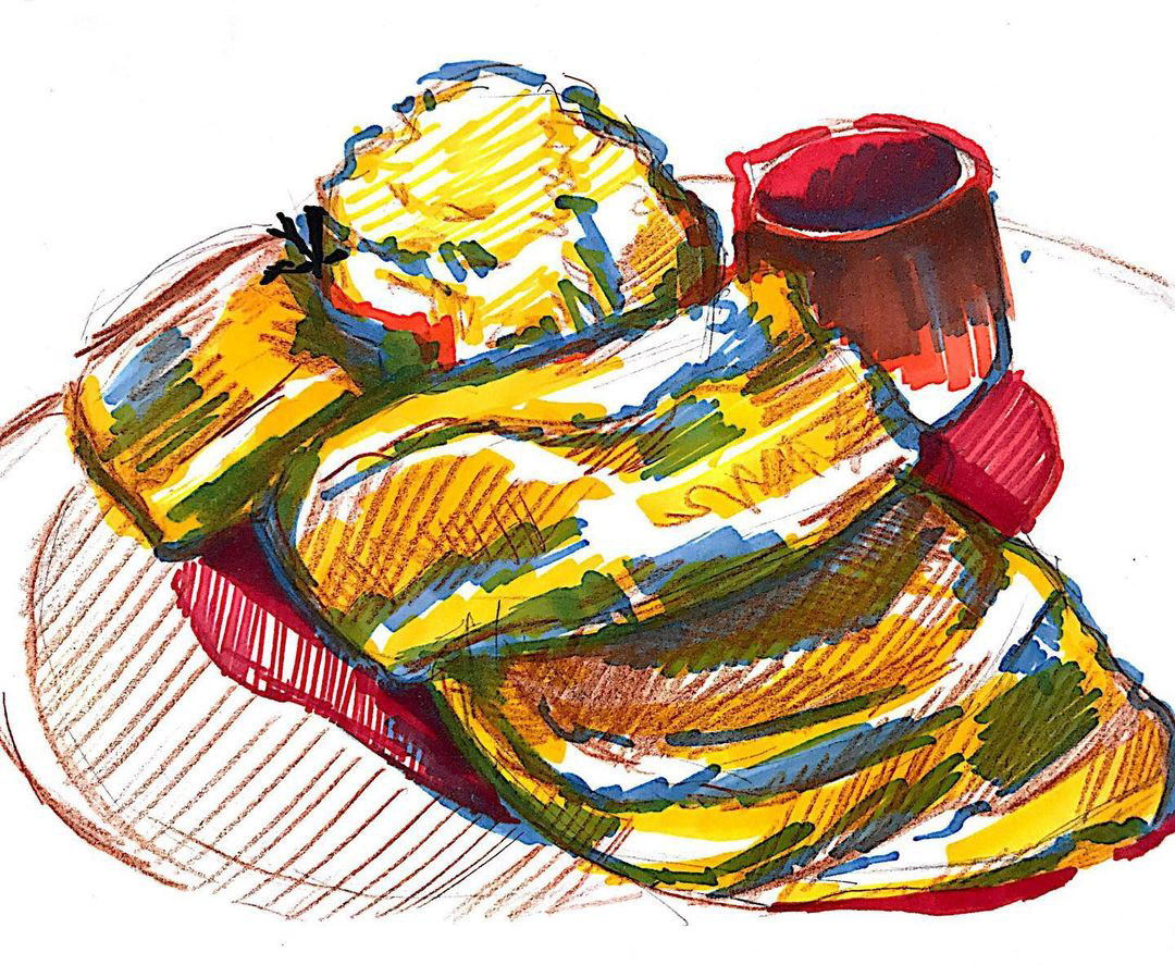
This is one of my favourite pieces because this was my first time experimenting with Copic marker pens and instead of following the original colours of the pancake, I decided to just stick to mainly yellow, red and blue. This style of illustration was more of a sketch and of a quicker style which I really enjoyed doing and liked the outcome of. I marked the light and shade with the markers and added texture with the coloured pencils.
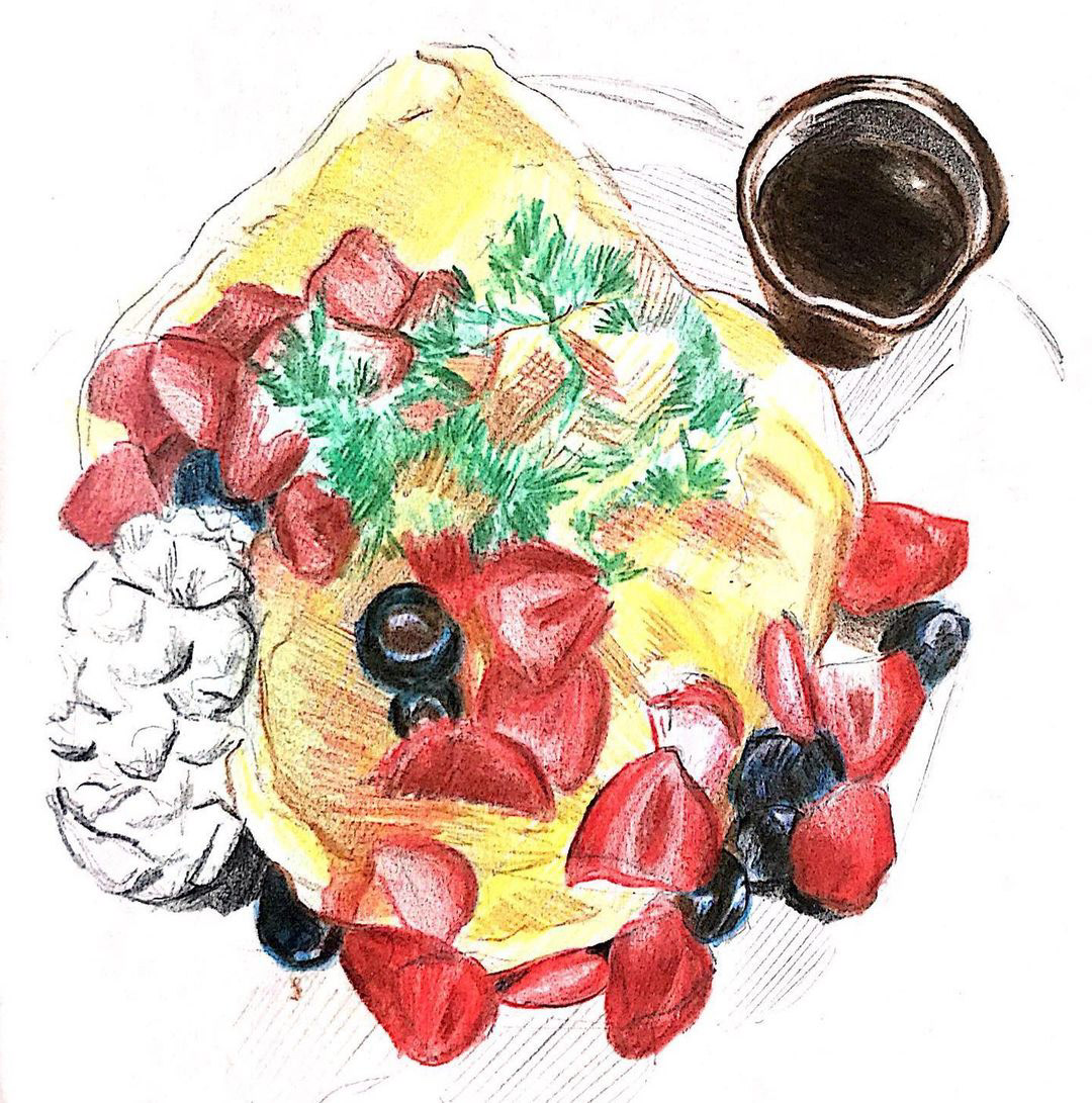
To further my interest within Japanese pancakes (of course), I used coloured pencils to illustrate a more realistic piece of the dish but still incorporating my own style and 'quick-sketch' technique. I was able to get the restaurant itself- Hula Grill: the garden- to see my illustration and follow my art account as well!

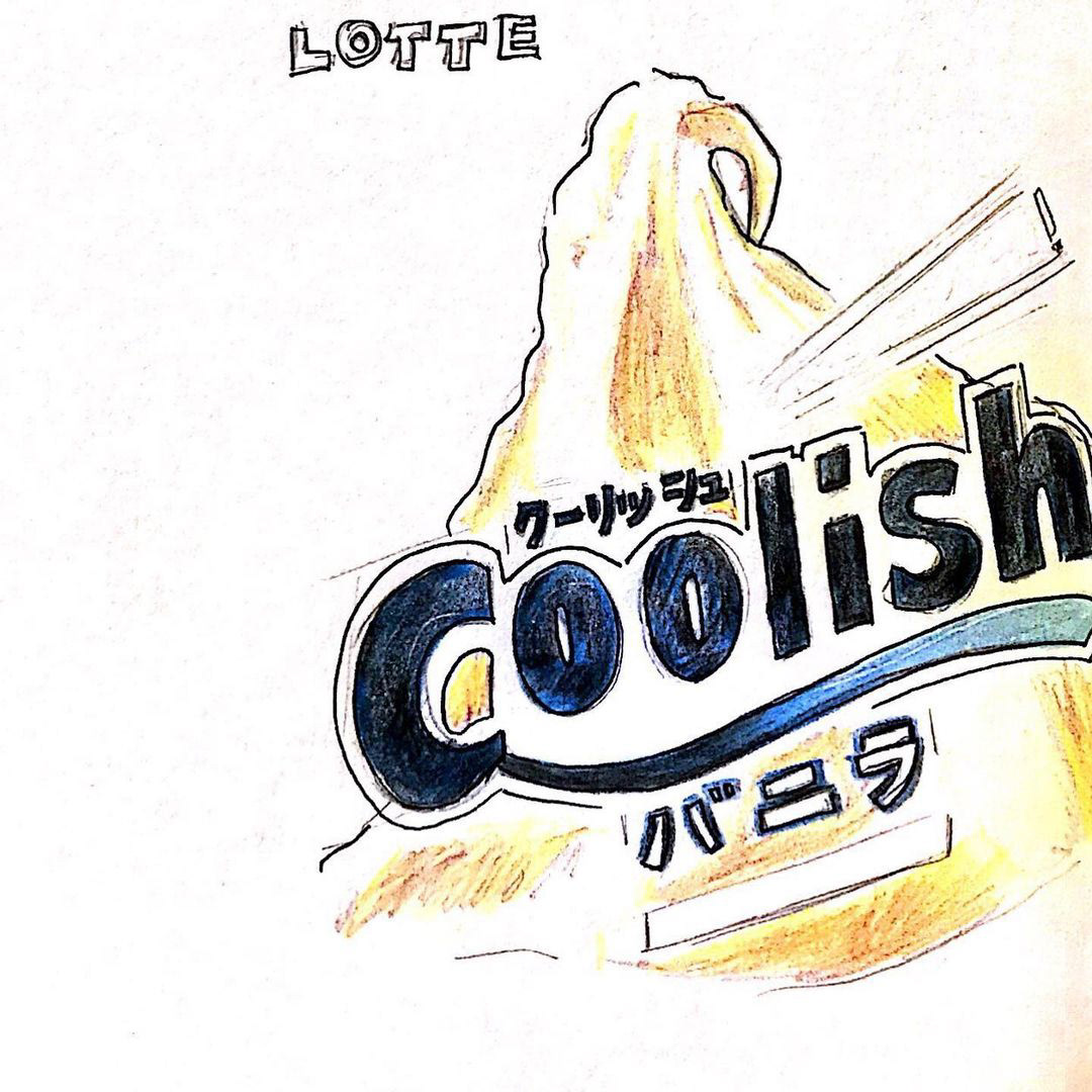
The trains in Japan are a combination of both old and new technology and I challenged myself to be able to capture the complexity of these machines. This train that I illustrated above was taken in Ueno where I was also able to see one of Yayoi Kusama's installation pieces and eat really good curry! I also illustrated the logo of my favourite ice-cream for summer that I found in Osaka: Coolish.
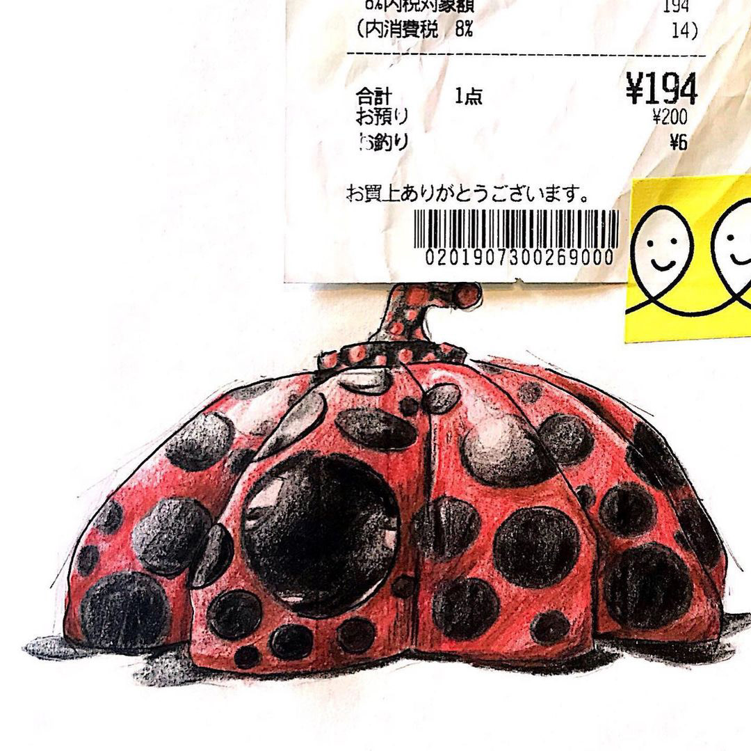
This was the first time I saw Yayoi Kusama's works in person and knew of her as an artist. The interesting patterns and odd but beautiful shapes were what intrigued me the most. This interactive piece at Ueno was for families to go in and look out of and really emphasised the size of it. Families looked like little ants compared to the figure itself.
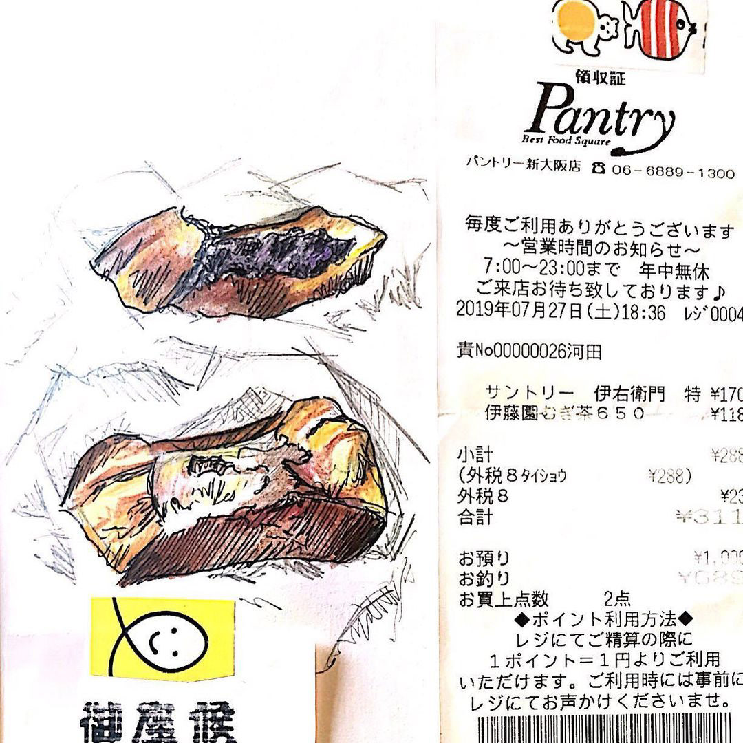
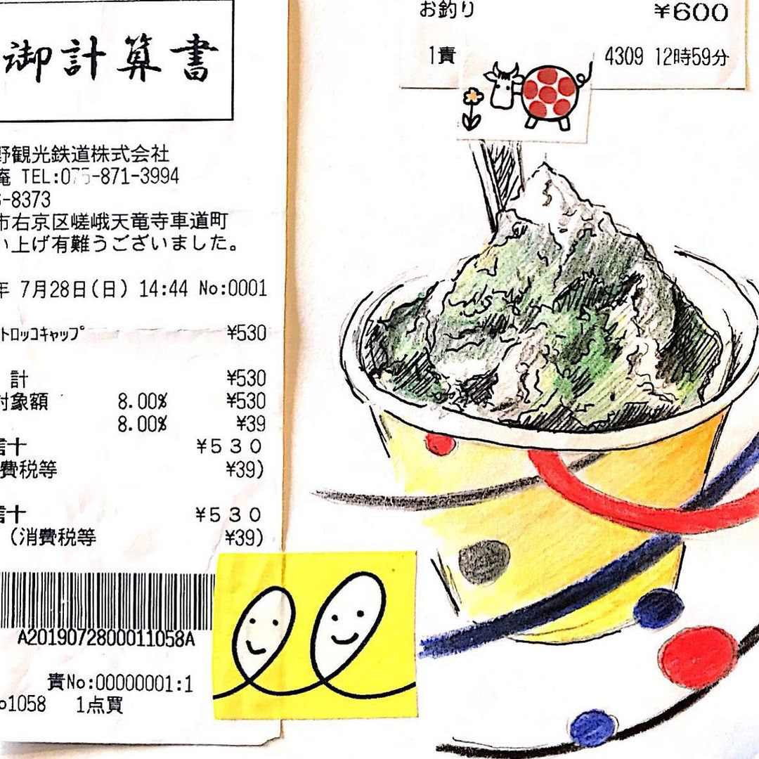
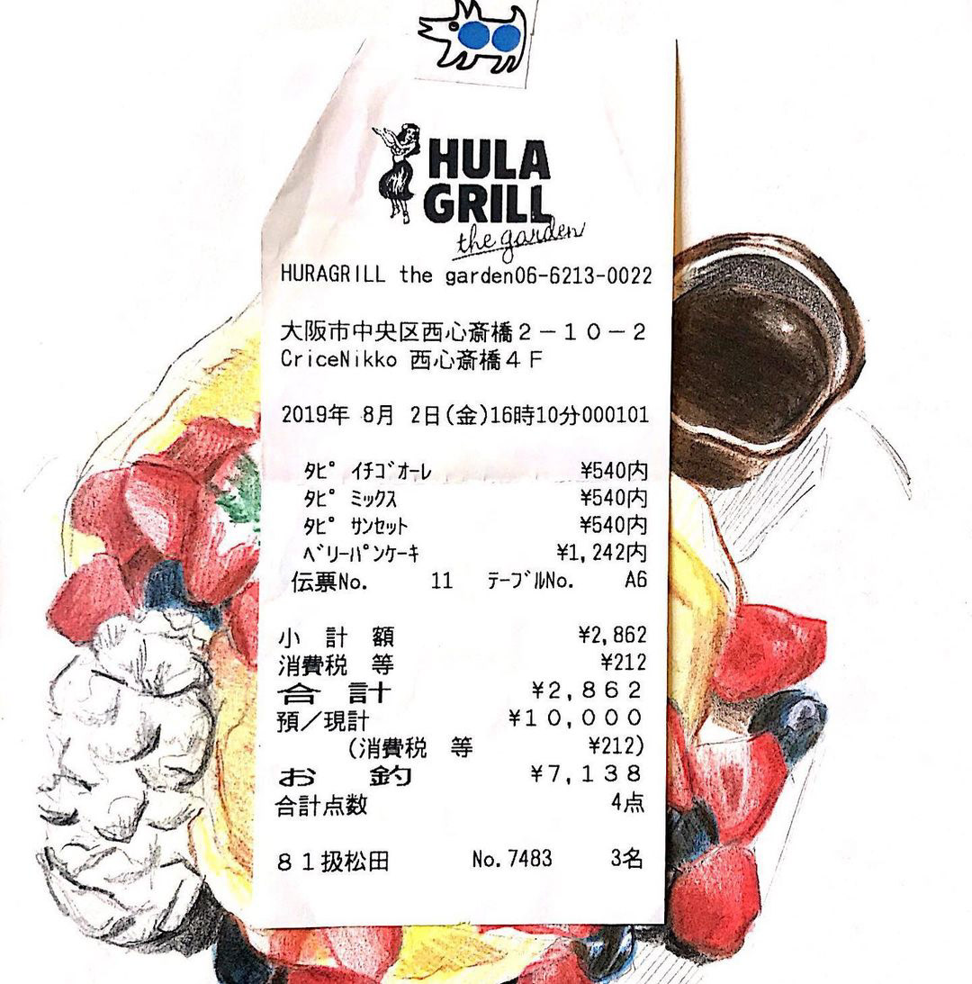
These two illustrations were one of the first that I did on the trip. A common theme that I seem to notice now in these illustrations is definitely pancakes and ice-cream but it was because it was summertime. Throughout this trip, I included the receipts for the items that I drew to give context to the places and activities that I went and did. It was also a nice reminder of the things I bought there as well.