
This is my sample typeface design for IKEA. The brief was to create a modular typeface design that experimented with shapes and worked with the brand's identity. For my design, I was inspired by the innocence and fun associated with building blocks children played with. I specifically chose to go for this idea because I personally associate IKEA with a family activity brand where families come together and it was a nice reminder for that.
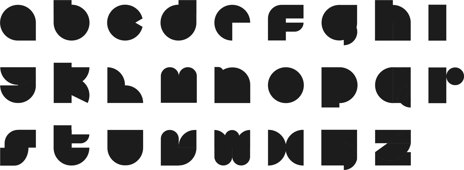
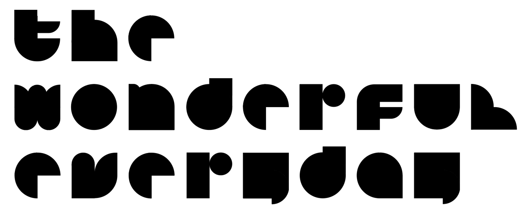
On the left is the alphabet of my modular type design and on the right is a sample of me using the letters that I designed to create IKEA's slogan "the Wonderful Everyday". Instead of going in with capital letters, I chose to work with non-capital letters because it made my typeface look more friendly and approachable.

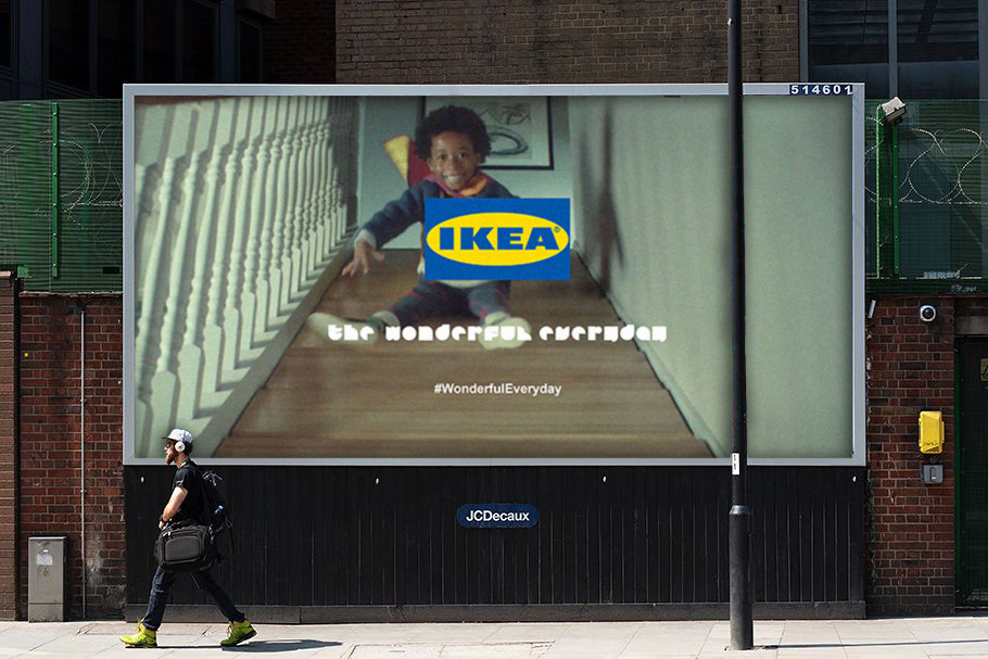
Mockups of my typeface with the IKEA logo on an advertisement (left: desktop screen, right: billboard)